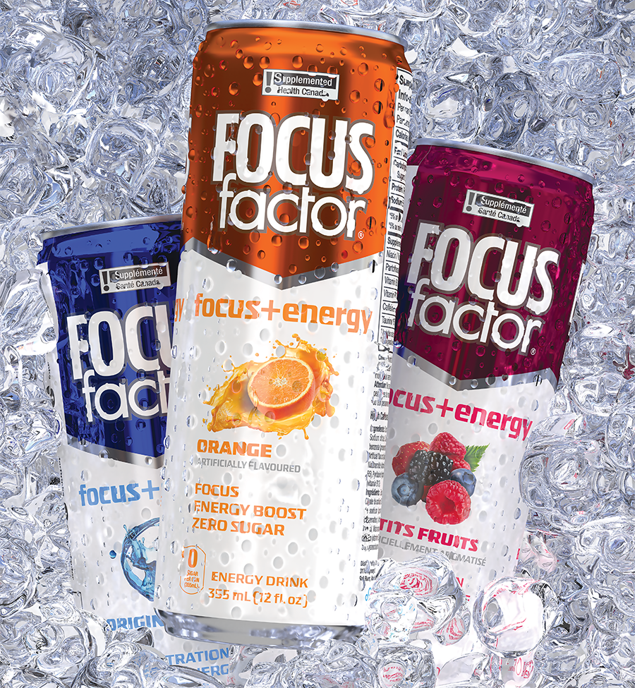
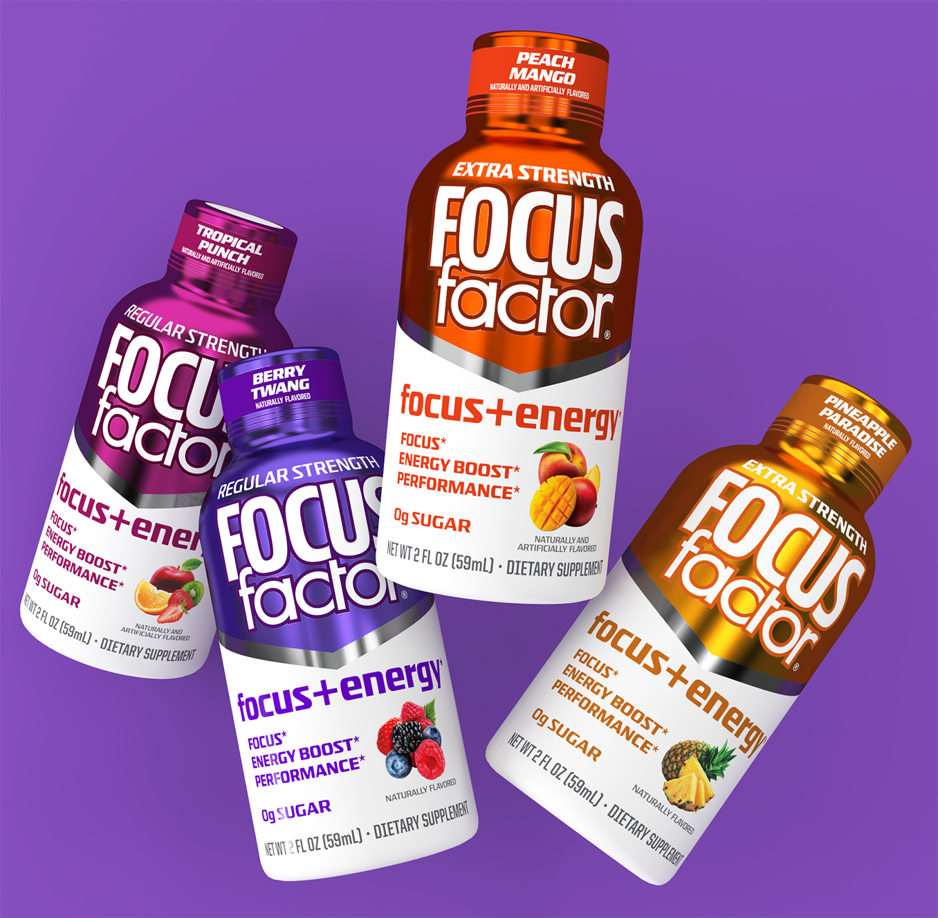
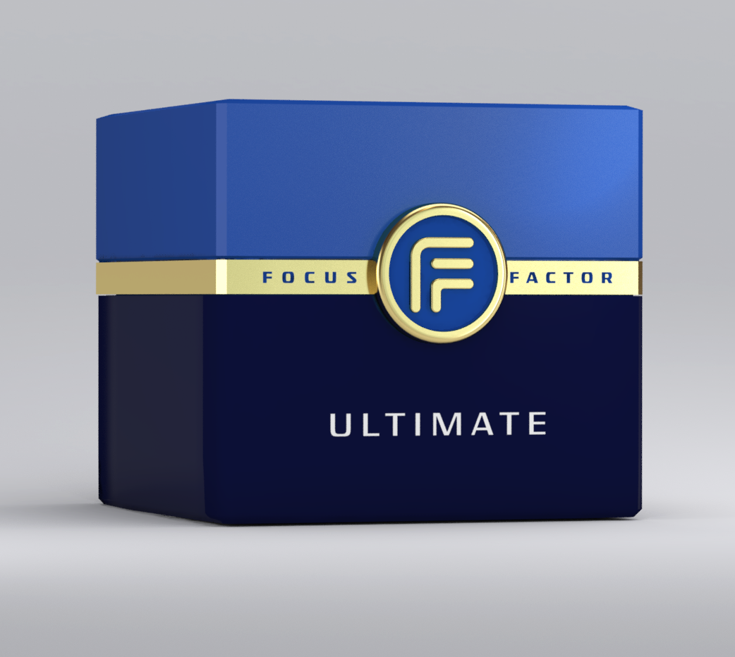
Focus Factor Energy Drinks Packaging Design created for Synergy CHC. The objective was to use the legacy Focus Factor brand design and architecture while pumping up the flavor cues to give the line a delicious look while delivering ingredients for focus.
Focus Factor Shots went through quite a few iterations before emerging with the new look. Once this design was approved, we moved forward with five new flavors that included 12 count self-display cartons seen here. Buyer reactions were strongly supportive of this new presentation.
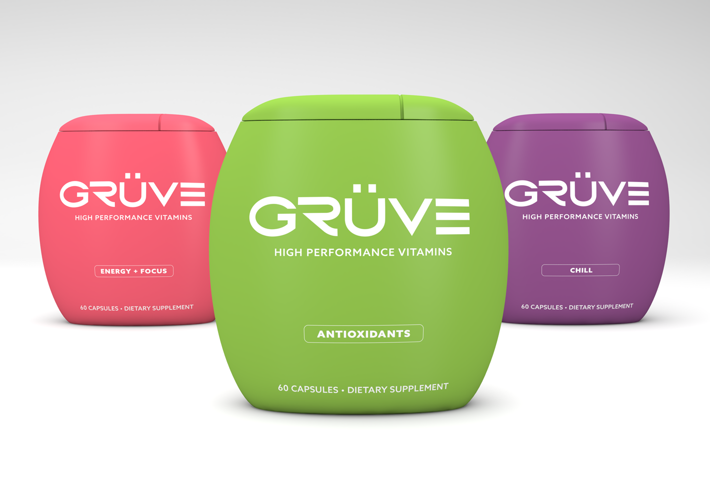
The packaging design for GRUVE SUPPLEMENTS stands as a testament to the brand's innovative and bold approach to wellness. Emphasizing the uniqueness of their product, the design features a highly distinctive container that not only visually differentiates it from competitors but also symbolizes the advanced and custom formulations crafted in a Swiss laboratory. This choice in packaging reflects the brand's commitment to delivering unparalleled performance and efficacy, with clinical results that are off the charts. The design is a physical embodiment of GRUVE SUPPLEMENTS' ethos, combining form and function to create a product that is as effective as it is visually compelling, ensuring it captures the attention of health-conscious consumers looking for the next level in dietary supplements.
The commemorative Super Bowl 51 Pepsi Zero can was designed to seamlessly blend the rich heritage of Dallas, Texas, with the electrifying halftime performance by Lady Gaga, creating a unique collectible that resonates with fans and collectors alike. The can's packaging design incorporated intricate, western hand-tooled motifs reminiscent of classic Texan leatherwork, symbolizing the rugged spirit and enduring legacy of the host city. This traditional craftsmanship was juxtaposed with vibrant, dynamic illustrations that captured the high-energy, flamboyant essence of Lady Gaga's performance, embodying the fusion of tradition and contemporary flair. The result was a visually striking design that celebrated the Super Bowl's grandeur while paying homage to the cultural nuances of Dallas and the unmistakable vibrancy of Lady Gaga, making it a memorable keepsake for anyone who appreciates the artistry of packaging design.
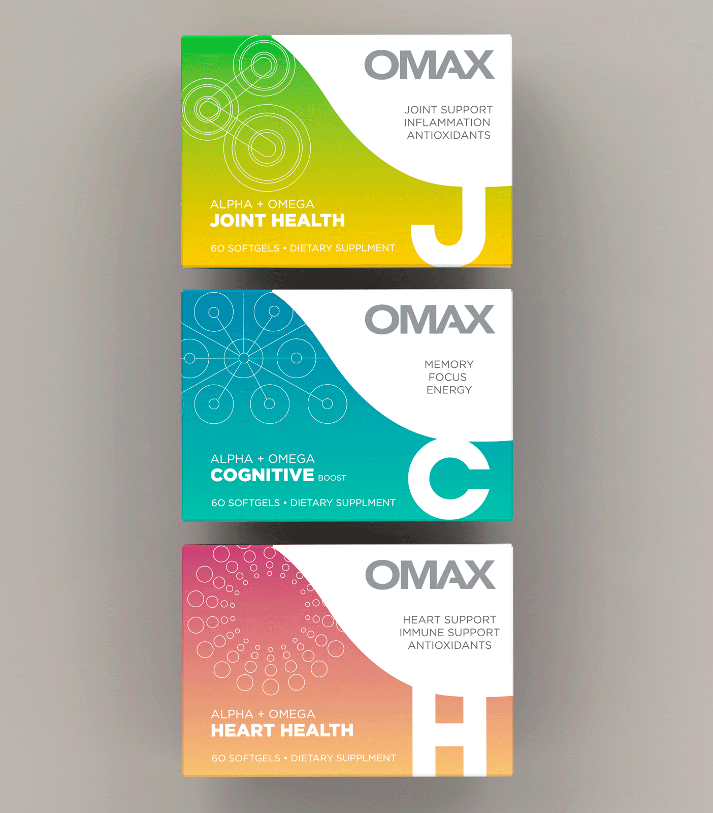
OMAX's packaging design embodies the essence of innovation and purity, setting a new standard in the health supplements industry. The design language speaks to the brand's commitment to efficacy and cleanliness, utilizing a minimalist aesthetic that conveys the potency and purity of their next-generation supplements. Sharp, clean lines and a restrained color palette are meticulously chosen to reflect the brand's focus on delivering high-quality, effective products. This careful attention to detail ensures that the packaging not only stands out on the shelf but also communicates the brand's core values of trustworthiness and cutting-edge health solutions, making OMAX a distinguished leader in the realm of health and wellness.
The packaging design of ATHENA PROTEIN DRINK is meticulously crafted to appeal to the vibrant, health-conscious young women leading an active lifestyle. Its sleek and user-friendly container embodies a sense of simplicity and modernity, with a clear, easy-to-read label that highlights the drink's natural and healthy protein content. The design leverages soft, inviting colors that resonate with a sense of wellbeing and femininity, and uses imagery and typography that communicate energy, vitality, and connection with nature. This packaging stands out on the shelves as not just a product, but as a lifestyle companion, promising nourishment that is perfectly aligned with the dynamic rhythm of its consumers' daily lives.
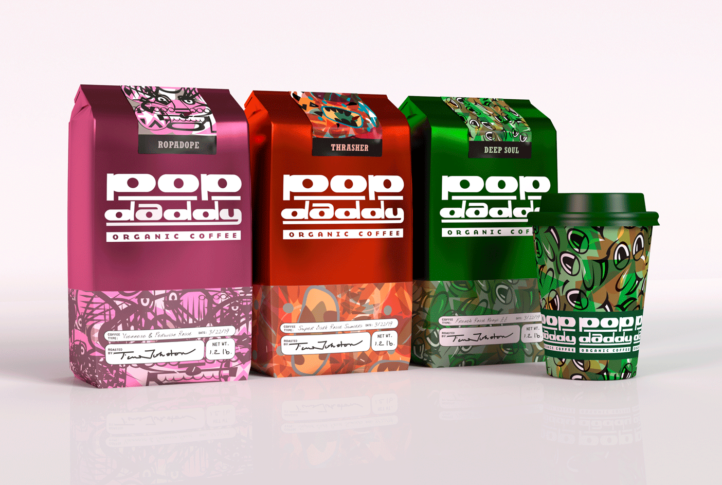
The packaging design for the new line of bespoke, small-batch coffee, POP DADDY, epitomizes the brand's fanatic attention to quality and its devotion to crafting artisanal blends that boast superior aroma and taste. With its elegant and sophisticated aesthetics, the design incorporates rich, warm colors that evoke the lush terrains of coffee origins, alongside tactile materials that invite touch, subtly conveying the bespoke nature of each batch. Gold foil accents highlight the exclusivity and premium quality, while clear, artisanal typography and imagery of coffee cherries and beans narrate the journey from bean to cup. This design not only promises a sensory delight that matches the product's refined flavors but also establishes POP DADDY as a beacon of luxury in the coffee industry, appealing to connoisseurs and casual coffee drinkers alike.
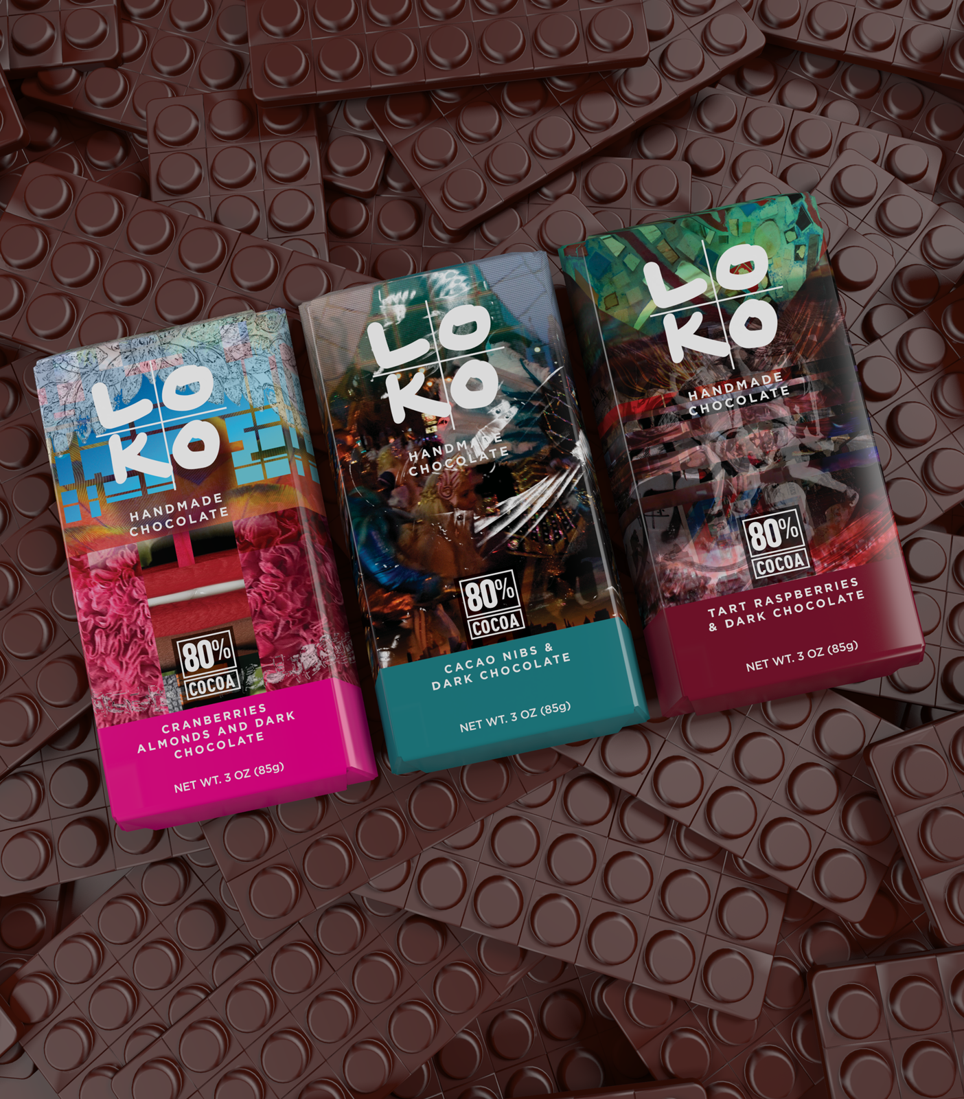
The packaging design of LOKO CHOCOLATE exemplifies elegance and luxury, artfully encapsulating the brand's commitment to handcrafted excellence and the pursuit of the richest flavors in chocolate craftsmanship. Each element of the design is meticulously curated to evoke a sense of indulgence and premium quality, from the choice of materials to the intricate details and textures that grace the surface of the packaging. The sophisticated visual aesthetic not only reflects the artisanal nature of the chocolate bars within but also promises an unparalleled sensory experience, inviting consumers to savor the depth and complexity of flavors that LOKO CHOCOLATE prides itself on. This packaging is not just a container, but a gateway to a world of exquisite taste and a celebration of chocolate-making artistry at its finest
To add
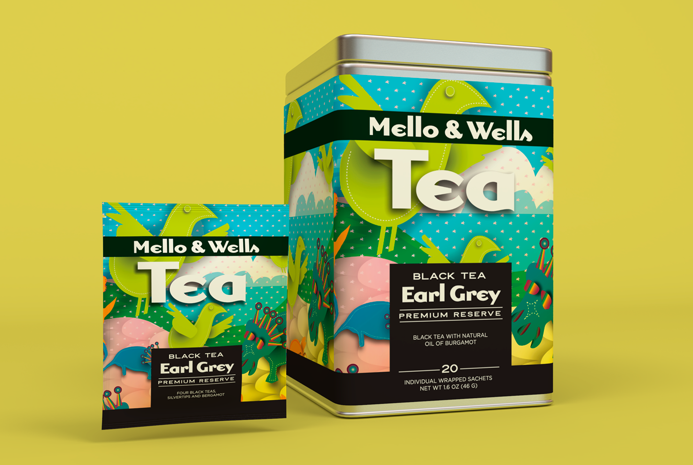
The packaging design for MELLO & WELLS TEA embodies a fusion of tradition and wellness, reflecting the brand's deep-rooted passion for herbal teas that transcend the ordinary. With a focus on showcasing their exceptional range of traditional and medicinal blends, the design captivates consumers through its vibrant visuals and thoughtful details. Each element, from the color palette to the textures, is carefully chosen to evoke a sense of warmth, authenticity, and healing, promising an immersive experience that begins even before the tea is brewed. This approach not only differentiates MELLO & WELLS TEA from average commercial brands but also resonates with consumers seeking a more profound connection with their choice of beverage, making each cup a testament to the art and science of herbal tea.
The packaging design of NUNU ICE CREAM encapsulates the brand's vibrant and youthful spirit through its lively and colorful aesthetic. Crafted with the intention of capturing the attention of consumers amidst a crowded store freezer, the design utilizes a playful and exuberant approach that reflects the handmade essence of the ice cream. Bold typography, a dynamic color palette, and whimsical illustrations combine to create an eye-catching visual that not only differentiates NUNU ICE CREAM from its competitors but also communicates the brand's commitment to fun and quality. This strategic use of design elements ensures that the packaging is as memorable and inviting as the delicious ice cream it encases, appealing directly to the brand's energetic young target audience.