A successful packaging design process begins with understanding the business behind the brand and the consumer who ultimately buys it. We begin every engagement by immersing ourselves in the client’s objectives, product benefits, competitive landscape, and target audience. We examine category conventions, emerging trends, retail environments, and consumer purchasing behaviors to identify opportunities for differentiation. This discovery phase establishes a strategic foundation for creative development, ensuring that every design decision serves a purpose. Our goal is not simply to make a product look different, but to identify the most compelling way to position it, communicate its value, and create a meaningful connection with consumers.
With a clear understanding of the opportunity, we develop a distinctive creative strategy and visual direction that defines how the product should look, feel, and communicate. We explore multiple creative territories, challenging category norms while remaining grounded in the brand’s positioning and commercial objectives. Typography, color, imagery, graphic language, structural form, and messaging are considered as an integrated system rather than isolated design elements. We bring a highly personalized, senior-level approach to this stage, allowing us to move beyond predictable solutions and pursue bold, ownable ideas. The result is a creative direction designed to capture attention, communicate a clear point of difference, and give consumers a compelling reason to choose the product.
The next phase transforms strategic thinking into tangible design concepts. Through detailed visualizations, packaging mockups, and realistic 3D renderings, we bring each creative direction to life before committing to production. We evaluate how the package performs across different viewing distances, retail settings, e-commerce platforms, and product configurations. We consider shelf impact, visual hierarchy, readability, brand recognition, and the speed at which consumers can understand the product’s key benefits. This is where creativity meets practical application: concepts are refined to ensure they are not only visually engaging but also commercially relevant, scalable across product lines, and adaptable to the realities of modern retail and digital commerce.
Collaboration and refinement are central to achieving the strongest possible result. We work closely with clients and their marketing, sales, product development, and manufacturing teams to evaluate concepts against the original objectives. Feedback is incorporated through a focused, iterative process that balances creative ambition with business priorities, technical requirements, budget considerations, and production feasibility. Our ability to combine strategic thinking with hands-on design expertise allows us to identify potential challenges early and resolve them before they become costly problems. By maintaining direct communication and an agile workflow, we eliminate unnecessary complexity, accelerate decision-making, and keep projects moving efficiently from initial concept through final approval.
Once a design direction is approved, we translate the creative vision into a production-ready packaging system. This involves finalizing structural considerations, artwork, typography, color specifications, regulatory information, and print requirements while ensuring consistency across every product variation. We understand that a great concept must perform just as effectively on the production line as it does in a presentation. Our attention to technical detail, material selection, print quality, and manufacturing constraints helps protect the integrity of the design while identifying opportunities for efficiency, cost savings, and scalability. The result is packaging that delivers on its creative promise without compromising the practical demands of bringing a product to market.
Ultimately, the measure of effective packaging design is its ability to create measurable business value. We approach every project with the understanding that packaging is a powerful commercial asset—one that can influence purchasing decisions, strengthen brand recognition, justify premium positioning, and help products outperform competitors. By combining consumer insight, distinctive creative thinking, disciplined execution, and commercial awareness, we create packaging that does more than attract attention: it gives consumers a reason to believe in the brand and a reason to buy. Our focus is on delivering meaningful impact rather than simply delivering artwork. We build distinctive packaging solutions that help clients elevate their brands, capture new opportunities, and turn creative investment into sustainable revenue growth.
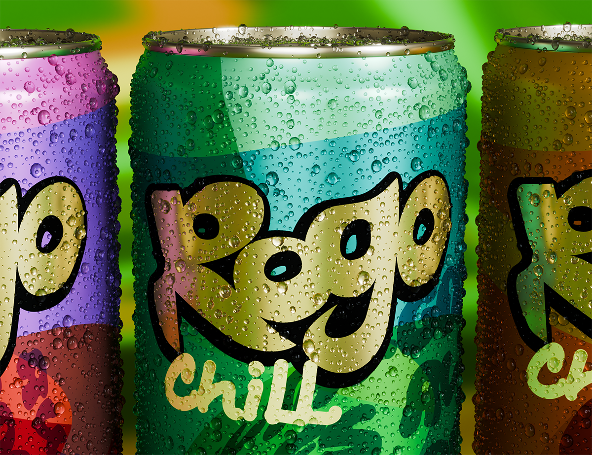
ROGO is redefining the energy drink experience by bringing relaxation and revitalization together in one bold, refreshing beverage. Designed to stand apart in a crowded retail marketplace, ROGO challenges the conventions of traditional energy drinks, replacing aggressive energy cues with a more balanced, feel-good approach. It’s a drink for consumers who want to recharge, refresh, and enjoy the moment without the intensity of the typical energy drink experience. At its heart is a simple, compelling idea: great flavor, a better mood, and a refreshing sense of ease.
Bright, bold, and impossible to ignore, ROGO uses distinctive packaging to deliver a message that breaks from the category: CHILL. The vibrant visual identity creates immediate shelf impact, while the relaxed attitude communicates the brand’s personality and promise. It’s an unexpected combination of high-energy design and laid-back appeal—a look that grabs attention while inviting consumers to slow down and enjoy themselves. ROGO isn’t just another drink fighting for attention; it’s a fresh take on refreshment that makes great taste and good vibes the reason to reach for the can.
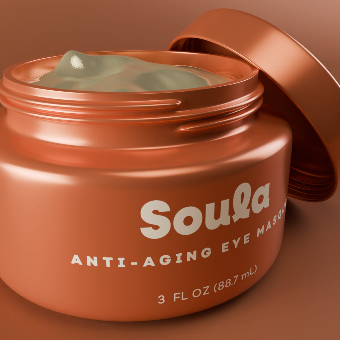
The Soula packaging design captures the essence of modern skincare through a sophisticated balance of rich color, minimalist typography, and understated elegance. Bold, luxurious hues create a distinctive visual presence, while clean, restrained typography communicates purity, confidence, and scientific sophistication. The result is a contemporary design language that bridges the natural origins of Soula’s organic ingredients with the advanced research behind its state-of-the-art formulations. More than simply a beautiful package, Soula’s visual identity positions the line as a premium skincare experience—one that feels fresh, modern, and indulgent while reflecting a commitment to effective, cruelty-free beauty.
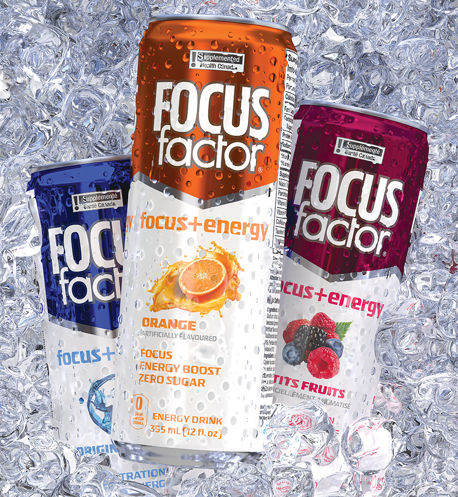
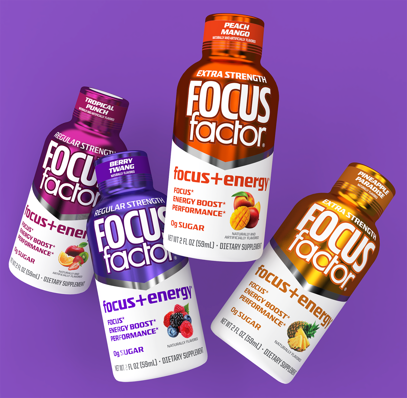
Focus Factor Energy Drinks Packaging Design created for Synergy CHC. The objective was to use the legacy Focus Factor brand design and architecture while pumping up the flavor cues to give the line a delicious look while delivering ingredients for focus.
Focus Factor Shots went through quite a few iterations before emerging with the new look. Once this design was approved, we moved forward with five new flavors that included 12 count self-display cartons seen here. Buyer reactions were strongly supportive of this new presentation.
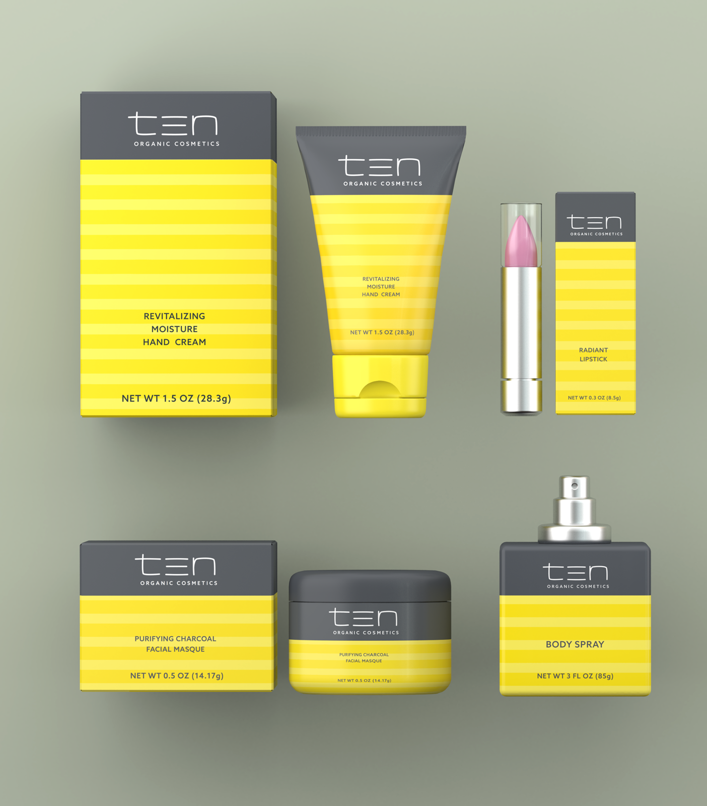
The packaging design of Ten Cosmetics embodies a vibrant celebration of youthful beauty and energy, tailored for its target audience of young women. Utilizing a palette of bright, eye-catching colors, each product in the line stands out on the shelves, beckoning with a promise of freshness and vitality. The design language speaks to the modern, dynamic nature of its consumers, incorporating playful patterns and bold typography that resonate with a sense of fun and confidence. This approach not only highlights the brand’s core values of joy and self-expression but also ensures that each item, from moisturizers to makeup, feels personal and empowering, making Ten Cosmetics a beacon of youthful allure in the beauty and skincare industry.
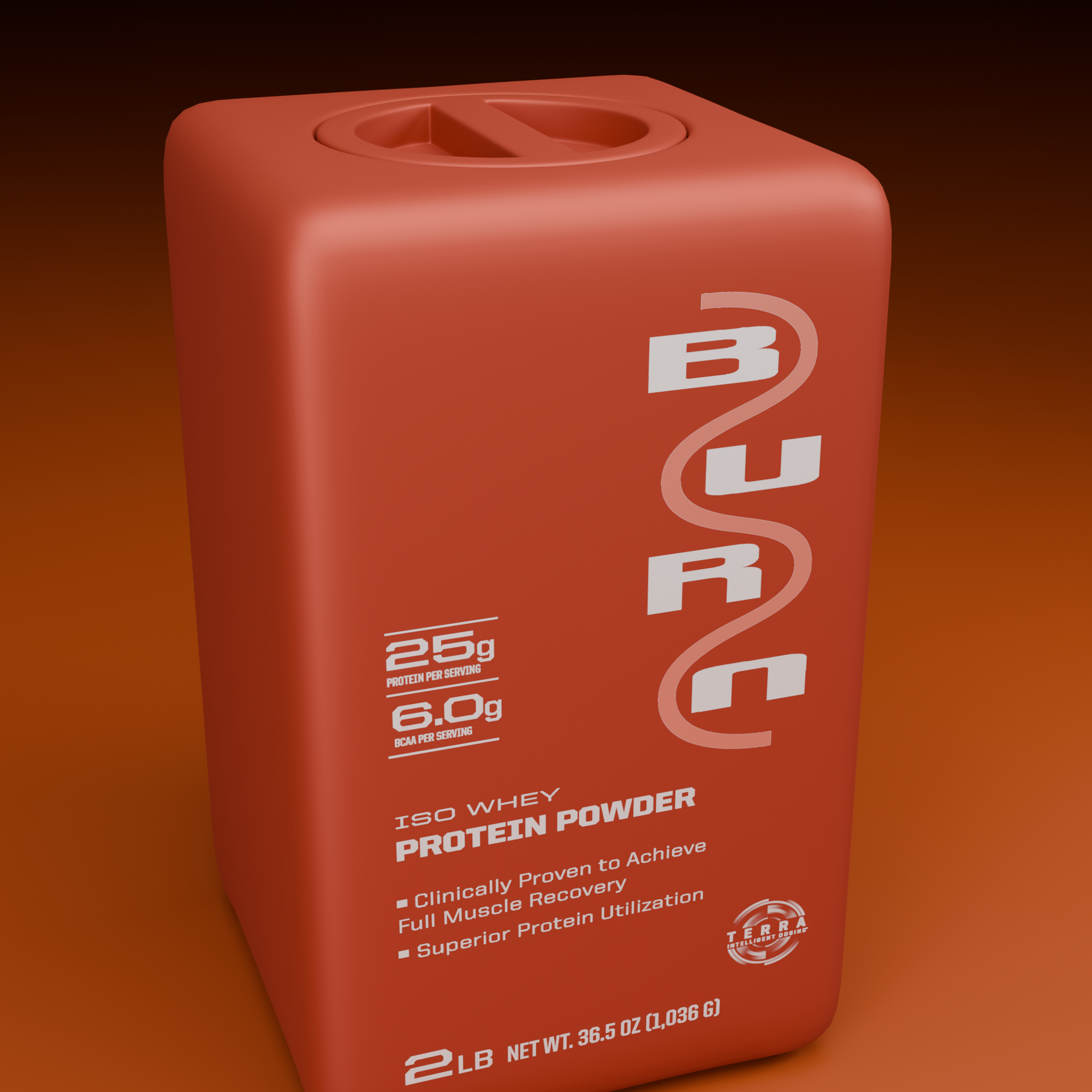
The development of BURN began with a challenge: disrupt a sports nutrition category dominated by predictable black packaging, aggressive graphics, and the familiar black-hoodie aesthetic. The design process started with an in-depth look at the competitive landscape, identifying opportunities to break category conventions and create a brand that would command attention at retail. The objective was to build a distinctive visual identity that communicated performance, innovation, and scientific credibility while delivering exceptional in-store brand recognition. Through bold creative exploration, unconventional color strategies, and a powerful graphic language, BURN was conceived to stand apart from the competition and establish a new visual standard for sports nutrition.
The resulting packaging design positions BURN as innovative, science-based, and unapologetically sexy. Every element—from the striking color palette and confident typography to the disciplined visual hierarchy—was developed to create maximum shelf impact without sacrificing the credibility expected of a high-performance nutrition brand. The aesthetic balances raw athletic energy with a refined, contemporary sophistication, transforming functional sports nutrition packaging into something consumers actively want to pick up and display. The result is an unmistakable brand presence designed to cut through retail clutter, challenge category conventions, and give BURN the visual firepower to compete, connect with consumers, and own its space in a crowded marketplace.
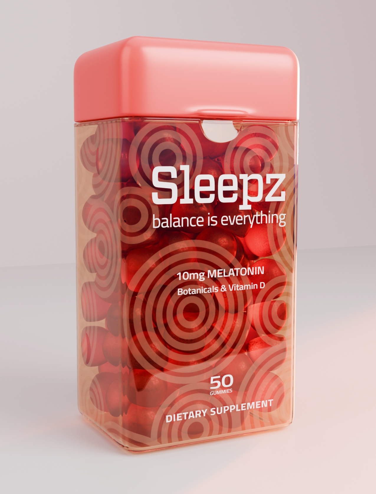
The packaging design process for SLEEPZ Gummies began with a simple but powerful objective: create a brand that stands out on the shelf while transforming an everyday sleep supplement into a distinctive consumer experience. The branding and graphics were developed to communicate relaxation, approachability, and great taste, giving SLEEPZ a memorable visual identity in a crowded wellness marketplace. Every element—from the typography and color palette to the overall graphic hierarchy—was carefully considered to balance strong retail recognition with a calming, inviting personality. The result is packaging that captures the appeal of a delicious gummy while clearly communicating its role as part of a nighttime wind-down routine.
Beyond the visual identity, the package form factor became an integral part of the design innovation. Rather than treating the container as simply a vessel for the product, the structural design was developed to enhance gummy dispensing and create a more intuitive, enjoyable interaction with the brand. This integration of form and function makes accessing the product feel effortless while adding a distinctive point of difference that extends beyond the shelf. By combining impactful branding, thoughtful structural design, and a user-focused approach, SLEEPZ Gummies delivers a cohesive packaging solution that elevates the product experience, reinforces brand recognition, and demonstrates how intelligent packaging design can create value at every consumer touchpoint.
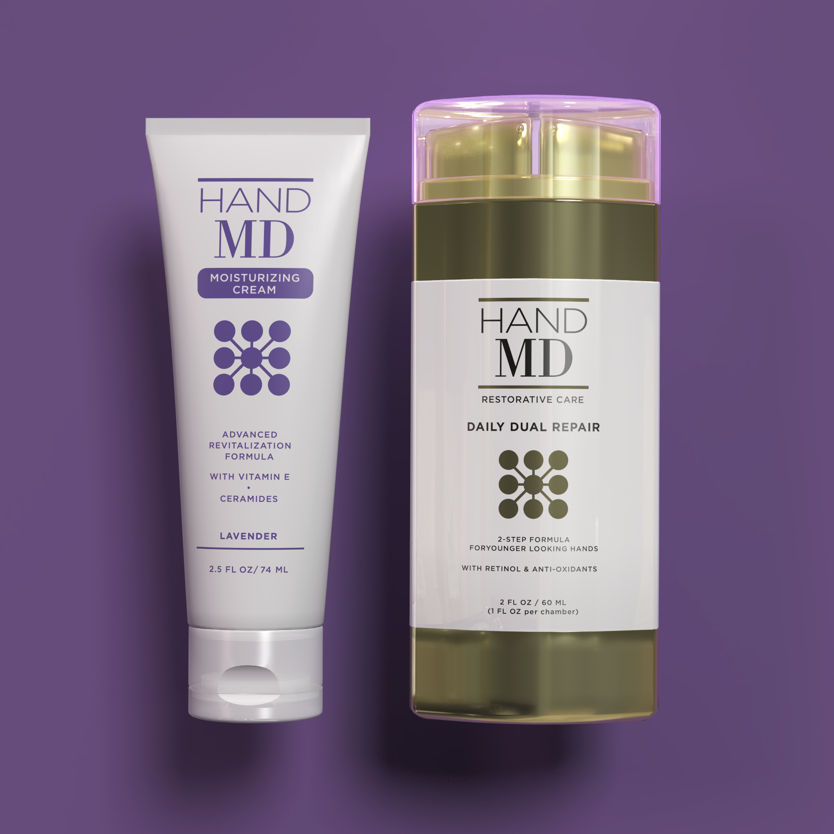
Hand MD brings a new level of sophistication to hand care, combining advanced skincare science with the visual language of prestige beauty. Recognized for its highly effective formulations and science-driven approach, the brand elevates an often-overlooked category into a premium skincare experience. The packaging design captures this positioning through a modern, sleek aesthetic that feels equally at home alongside luxury cosmetics and fine fragrances. Clean lines, refined typography, and a confident visual presence communicate innovation, performance, and quality, immediately setting Hand MD apart from conventional hand-care products.
The design strategy transforms functional hand care into a desirable beauty ritual. By embracing the elegance and sophistication of the cosmetic and fragrance marketplace, Hand MD creates a distinctive shelf presence that reinforces the advanced nature of its formulations while appealing to discerning, beauty-conscious consumers. Every design element works to balance clinical credibility with premium sensibility, making the packaging feel both technologically advanced and undeniably luxurious. The result is a contemporary brand identity that redefines expectations for hand care, elevates perceived value, and positions Hand MD as a standout player in the premium skincare category.
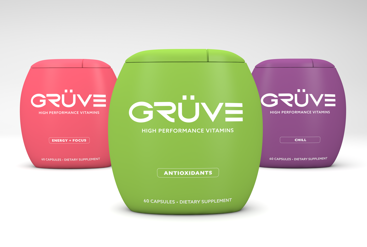
The packaging design for GRUVE SUPPLEMENTS stands as a testament to the brand's innovative and bold approach to wellness. Emphasizing the uniqueness of their product, the design features a highly distinctive container that not only visually differentiates it from competitors but also symbolizes the advanced and custom formulations crafted in a Swiss laboratory. This choice in packaging reflects the brand's commitment to delivering unparalleled performance and efficacy, with clinical results that are off the charts. The design is a physical embodiment of GRUVE SUPPLEMENTS' ethos, combining form and function to create a product that is as effective as it is visually compelling, ensuring it captures the attention of health-conscious consumers looking for the next level in dietary supplements.
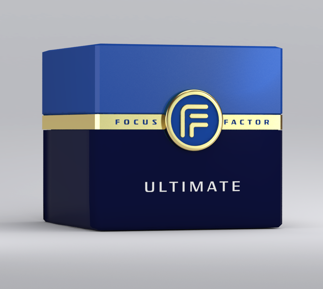
The packaging design development for Focus Factor Ultimate began with the ambition to elevate an established brain health brand into an entirely new tier of premium sophistication. Conceived as the ultimate expression of the Focus Factor portfolio, this luxury-targeted line extension demanded a visual identity that communicated exceptional quality, scientific credibility, and exclusivity. The design process focused on creating a dramatic departure from the core product line, exploring premium materials, refined typography, striking color contrasts, and distinctive graphic elements to signal that this was something truly extraordinary. With a formulation built around some of the most expensive and difficult-to-source ingredients available, Focus Factor Ultimate needed packaging that justified its elevated positioning and conveyed the sense of a high-performance, no-compromise product.
The resulting design was created to be a showstopper—an unmistakable statement of premium quality engineered to command attention in select, high-end retail environments. Every design decision was made to reinforce the product's elite status, from its confident visual hierarchy to its sophisticated finish and unmistakable shelf presence. Rather than simply extending the existing Focus Factor brand, the packaging establishes a new aspirational benchmark for the portfolio, balancing recognizable brand equity with a bold, luxury-driven aesthetic. Intended exclusively for fine retail stores, Focus Factor Ultimate transforms the package into a tangible expression of the product's exceptional ambition: a premium brain health offering designed to stand apart, elevate perceived value, and make an immediate impression on the most discerning consumers.
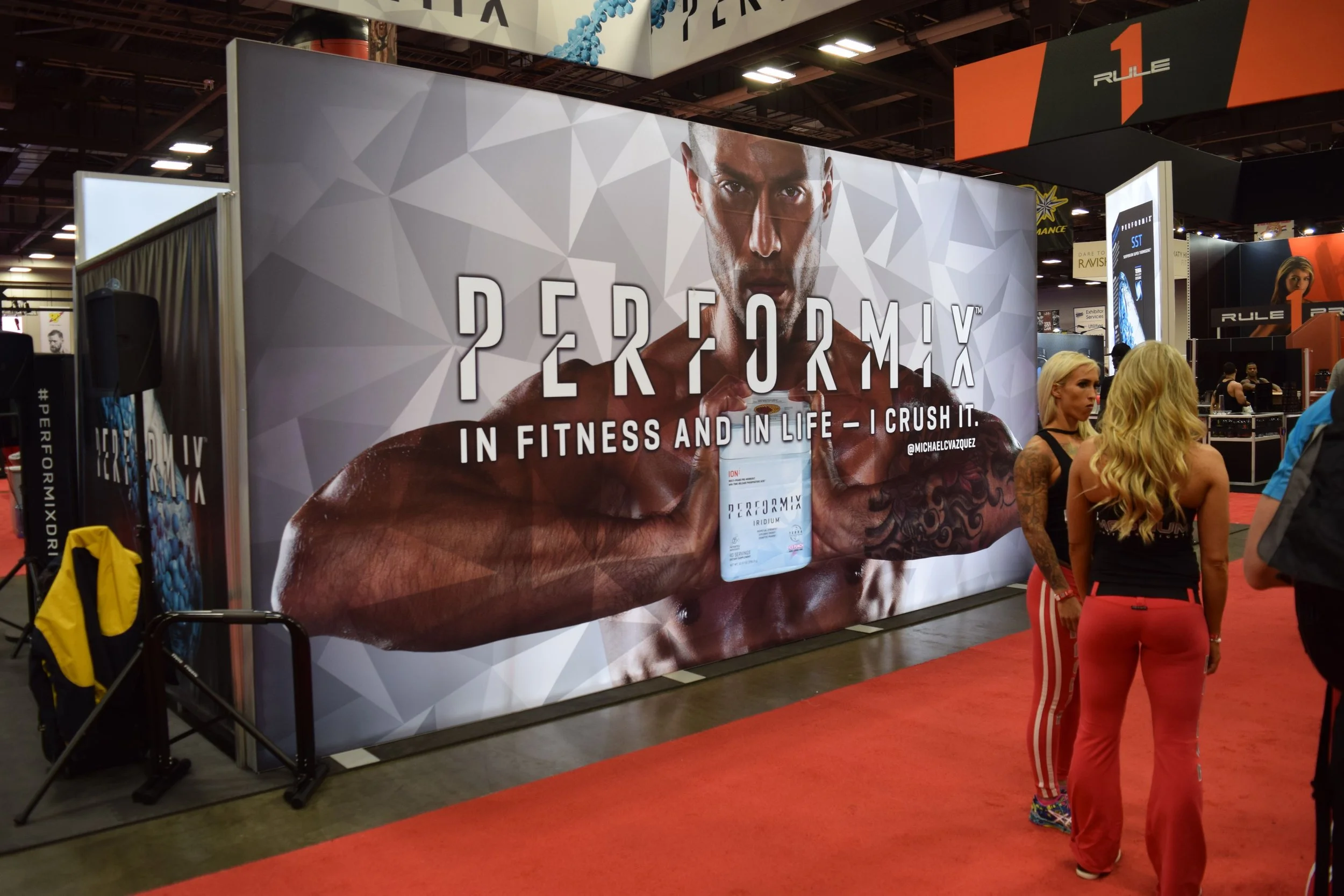
The visual design process for PERFORMIX at the Arnold Sports Festival began with a singular objective: establish the brand as a force at the forefront of advanced sports nutrition. The exhibit graphics were developed to break through the visual clutter of one of the fitness industry's most competitive environments, using bold typography, aggressive graphic elements, and a high-impact visual language that embodied the brand's uncompromising approach to performance. Every design decision was intended to communicate innovation, intensity, and scientific advancement, positioning PERFORMIX as a brand engineered for athletes who demand more from themselves and their nutrition. The result was a commanding visual presence designed to capture attention from across the exhibition floor and immediately establish PERFORMIX as a serious contender in the category.
The finished exhibit translated the aggressive spirit of the PERFORMIX formulations into an immersive brand experience built for serious, aspiring athletes. Hard-hitting graphics, dramatic visual contrasts, and a cohesive design system reinforced the brand's commitment to pushing performance boundaries and giving athletes an extra edge in pursuit of their goals. Rather than simply decorating a trade show space, the visual environment became an extension of the brand itself—confident, relentless, and unapologetically performance-driven. From initial creative exploration through final graphic execution, the process focused on creating a memorable brand statement that energized the audience, amplified PERFORMIX's innovative positioning, and made the exhibit a powerful expression of the brand's ambition to lead the future of sports nutrition.
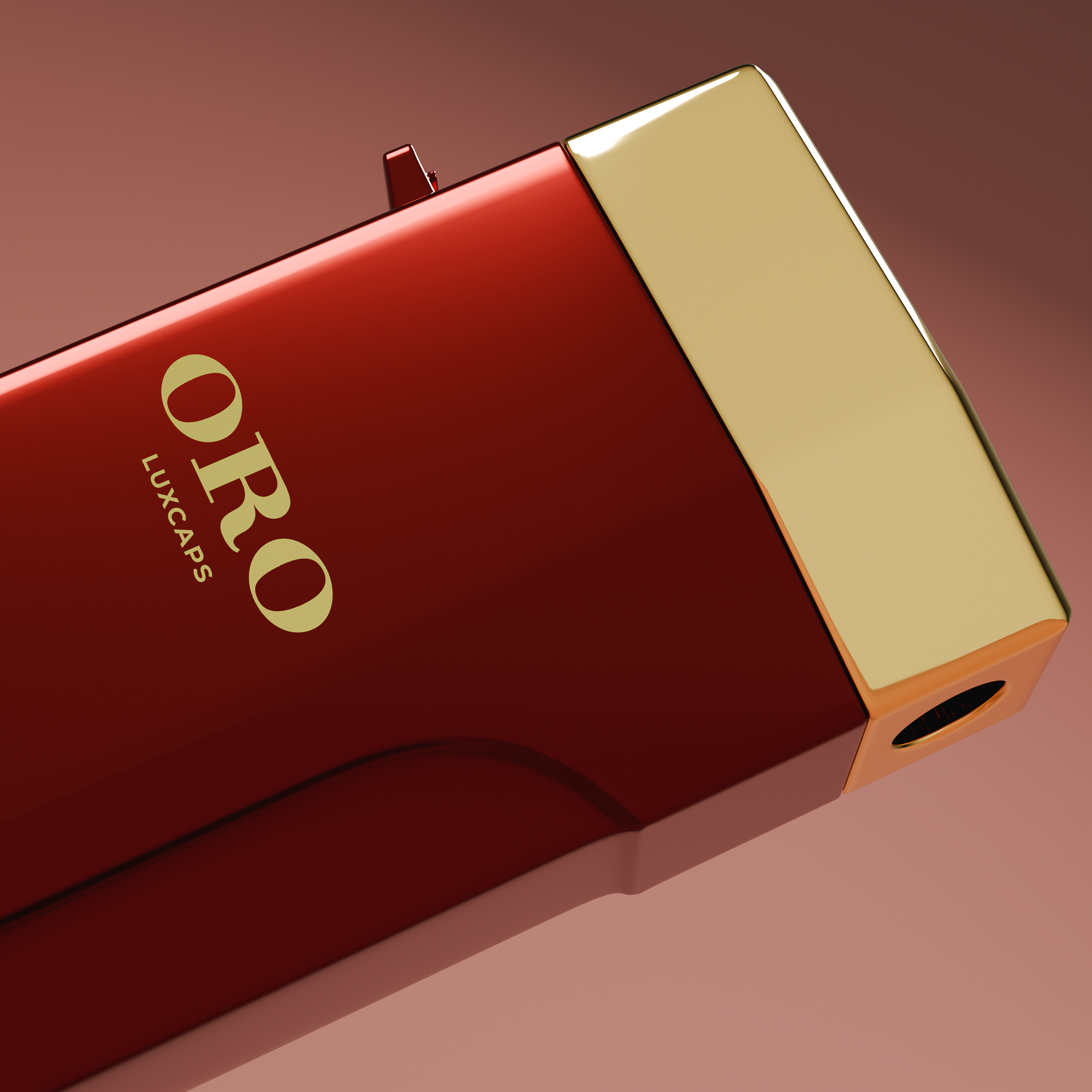
The packaging design strategy for ORO Luxcaps began with a bold ambition: redefine the visual language of luxury supplements by borrowing from the world of prestige cosmetics and fine jewelry. Rather than follow conventional supplement packaging cues, the design process focused on creating an elevated, unexpected aesthetic that communicates exclusivity, sophistication, and exceptional value. The container was conceived as a luxury object in its own right, with minimalist typography, refined proportions, and jewelry-inspired detailing working together to create a striking visual statement. Every design decision was intentional, moving ORO Luxcaps beyond the traditional supplement category and toward a premium beauty and lifestyle experience that feels truly distinctive.
The execution brought this vision to life through a seamless integration of form, finish, and visual restraint, creating a wildly unique consumer experience. The minimalist typography provides clarity and confidence, while the jewelry-inspired design elements introduce a sense of preciousness and desirability rarely seen in the supplement marketplace. The result is packaging that invites interaction, elevates the perceived value of the product, and transforms an everyday supplement ritual into something more akin to unboxing a luxury cosmetic or treasured accessory. By challenging category conventions and embracing a design language all its own, ORO Luxcaps establishes a compelling category-of-one identity—one that captures attention, inspires aspiration, and demonstrates the power of packaging to turn a premium product into an unmistakable luxury brand.
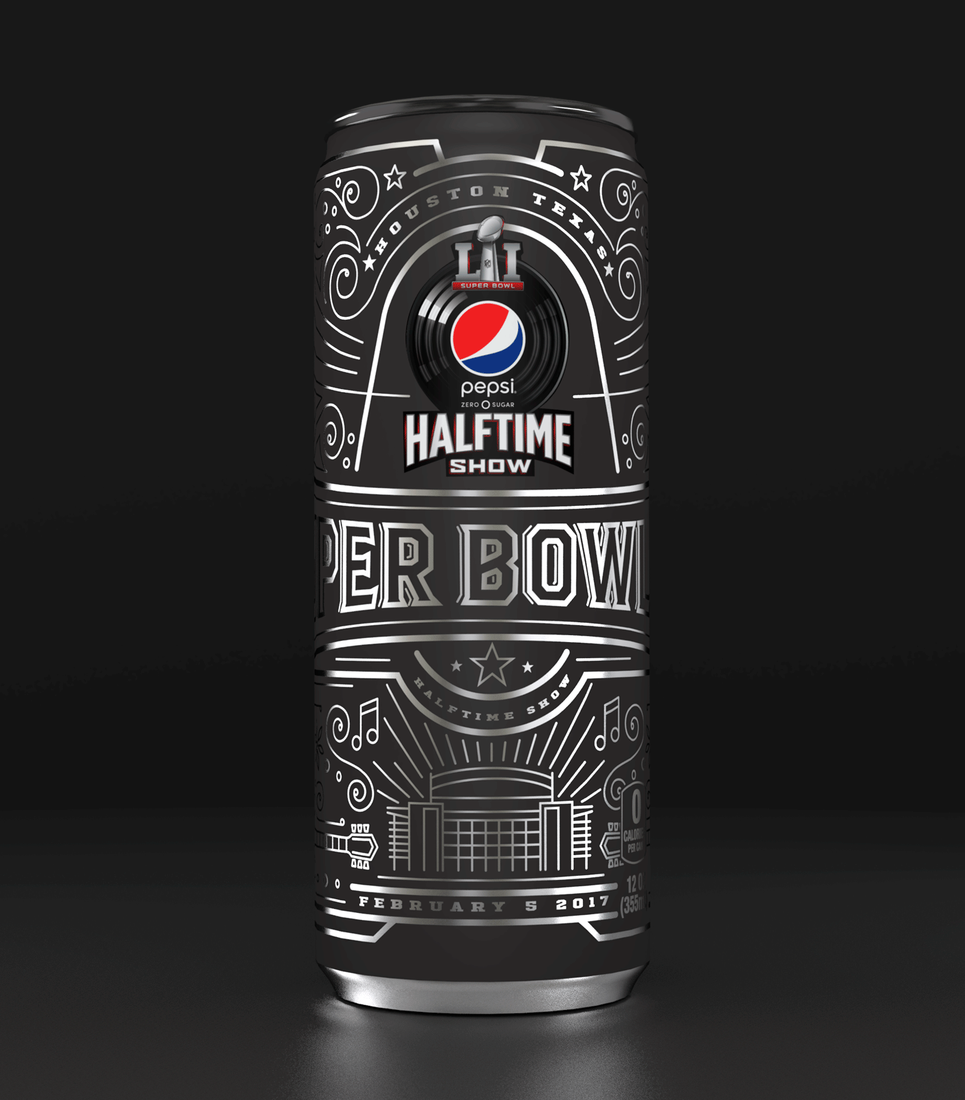
The commemorative Super Bowl 51 Pepsi Zero can was designed to seamlessly blend the rich heritage of Dallas, Texas, with the electrifying halftime performance by Lady Gaga, creating a unique collectible that resonates with fans and collectors alike. The can's packaging design incorporated intricate, western hand-tooled motifs reminiscent of classic Texan leatherwork, symbolizing the rugged spirit and enduring legacy of the host city. This traditional craftsmanship was juxtaposed with vibrant, dynamic illustrations that captured the high-energy, flamboyant essence of Lady Gaga's performance, embodying the fusion of tradition and contemporary flair. The result was a visually striking design that celebrated the Super Bowl's grandeur while paying homage to the cultural nuances of Dallas and the unmistakable vibrancy of Lady Gaga, making it a memorable keepsake for anyone who appreciates the artistry of packaging design.
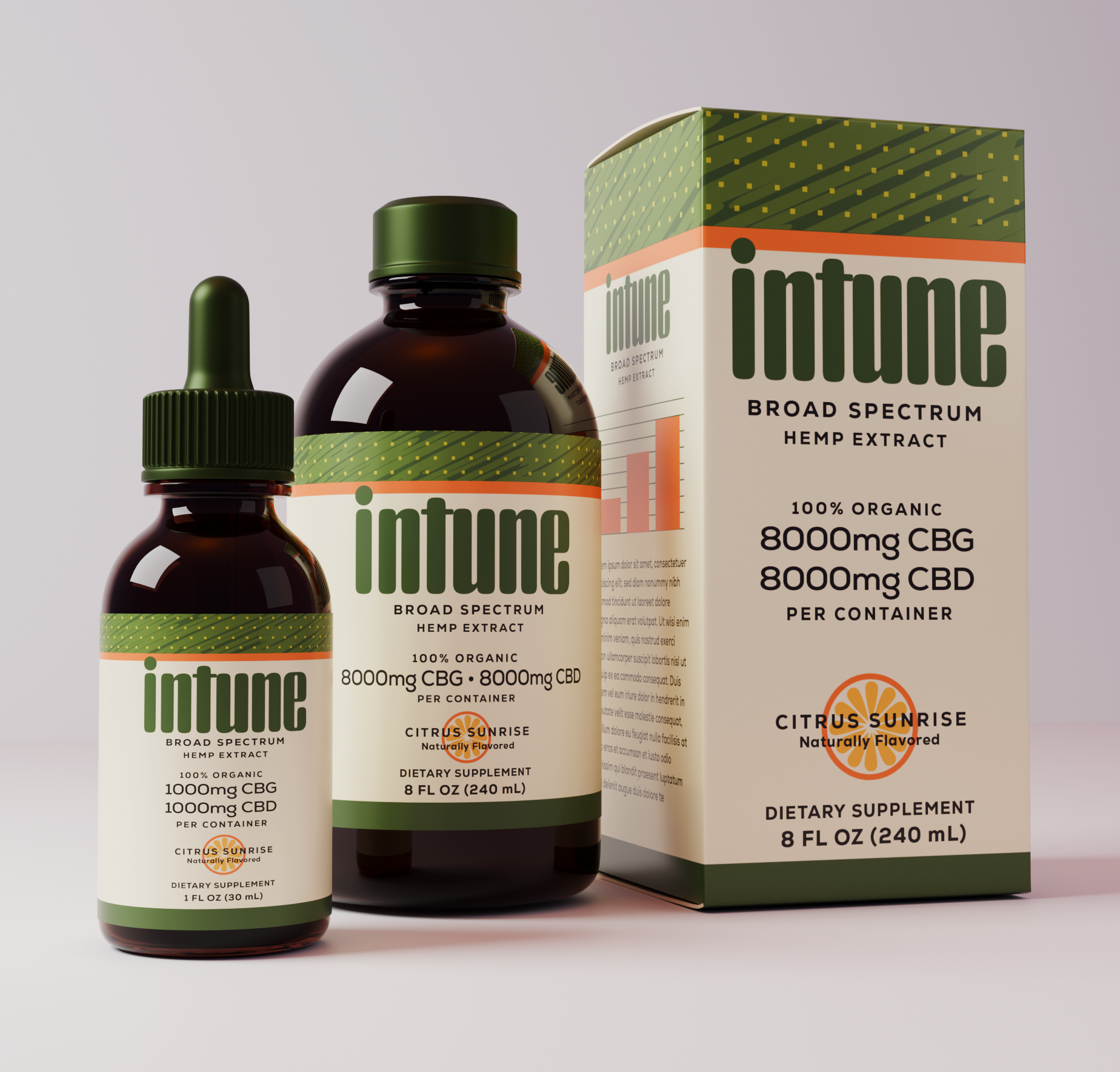
The packaging design process for Intune began with the challenge of creating a sophisticated, distinctive brand in an increasingly crowded CBD marketplace. The objective was to move beyond the category’s familiar visual clichés and develop a clean, confident identity that communicates quality, precision, and credibility. Through a considered balance of minimalist typography, disciplined graphic elements, and a sleek contemporary aesthetic, the design establishes a visual connection between premium ingredients and a science-led approach to product development. Every element was carefully refined to convey a sense of trust and sophistication, positioning Intune as a modern, quality-driven entrant that stands apart from conventional CBD brands.
The resulting packaging combines rich, distinctive color treatments with an unmistakable visual identity designed for immediate recognition and lasting brand appeal. The sophisticated palette creates a strong presence on the shelf, while the restrained design language reinforces the brand’s emphasis on quality, consistency, and formulation expertise. Rather than relying on excessive graphics or predictable category conventions, Intune uses confident simplicity to communicate its point of difference. The result is a cohesive packaging system that elevates perceived value, inspires consumer confidence, and positions Intune as a premium CBD brand where thoughtful design, quality ingredients, and a science-oriented philosophy come together in a compelling retail experience.
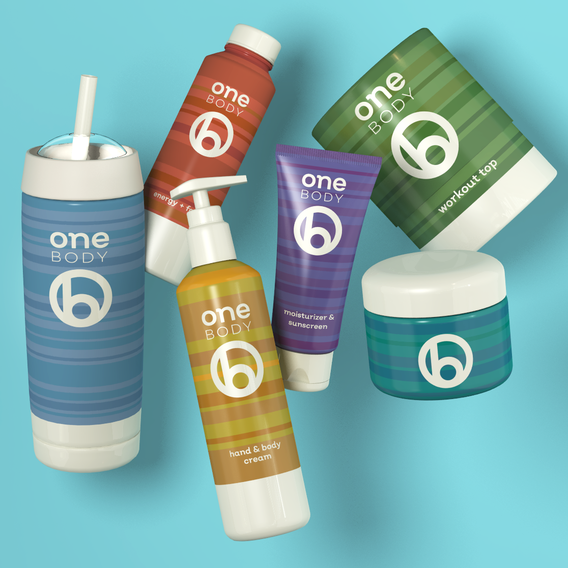
The packaging design process for One Body began with the creation of a unified brand strategy capable of spanning a diverse portfolio of personal care products, from everyday skin care essentials to advanced nutritional supplements. The challenge was to translate the brand’s foundation in organic, science-based formulas into a distinctive visual identity that felt both credible and approachable. A contemporary design language was developed to bridge the worlds of natural wellness and modern science, establishing a consistent brand architecture that could flex across multiple product categories while maintaining a strong, recognizable presence on the shelf.
The design execution focused on creating an energetic, youthful aesthetic that reflects an active, wellness-driven lifestyle. Clean typography, bold graphic elements, and a fresh, modern visual system gave One Body an unmistakable personality while allowing individual products to communicate their specific benefits clearly. Scalable packaging structures and a cohesive visual hierarchy ensured consistency across the expanding portfolio, creating a brand experience that feels accessible, aspirational, and contemporary. The result is a dynamic personal care brand designed to connect with a new generation of health-conscious consumers who view everyday wellness as an integral part of living well.
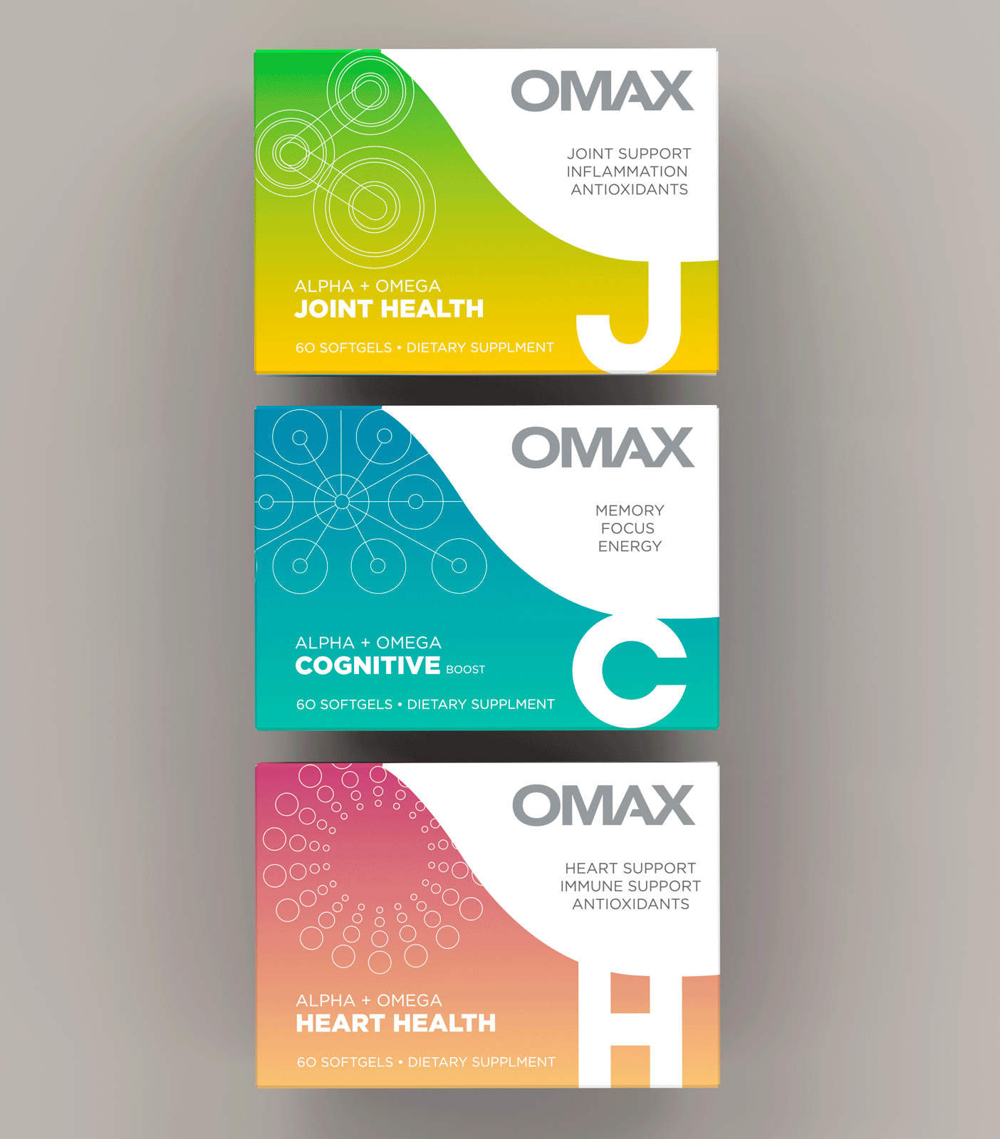
OMAX's packaging design embodies the essence of innovation and purity, setting a new standard in the health supplements industry. The design language speaks to the brand's commitment to efficacy and cleanliness, utilizing a minimalist aesthetic that conveys the potency and purity of their next-generation supplements. Sharp, clean lines and a restrained color palette are meticulously chosen to reflect the brand's focus on delivering high-quality, effective products. This careful attention to detail ensures that the packaging not only stands out on the shelf but also communicates the brand's core values of trustworthiness and cutting-edge health solutions, making OMAX a distinguished leader in the realm of health and wellness.
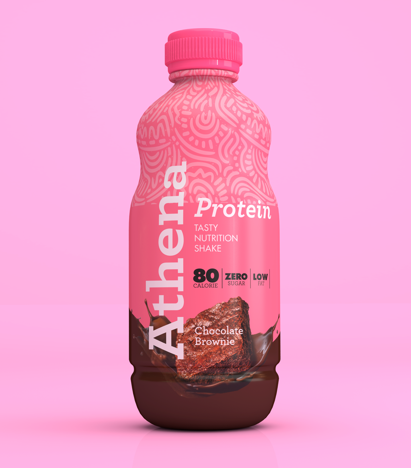
The packaging design of ATHENA PROTEIN DRINK is meticulously crafted to appeal to the vibrant, health-conscious young women leading an active lifestyle. Its sleek and user-friendly container embodies a sense of simplicity and modernity, with a clear, easy-to-read label that highlights the drink's natural and healthy protein content. The design leverages soft, inviting colors that resonate with a sense of wellbeing and femininity, and uses imagery and typography that communicate energy, vitality, and connection with nature. This packaging stands out on the shelves as not just a product, but as a lifestyle companion, promising nourishment that is perfectly aligned with the dynamic rhythm of its consumers' daily lives.
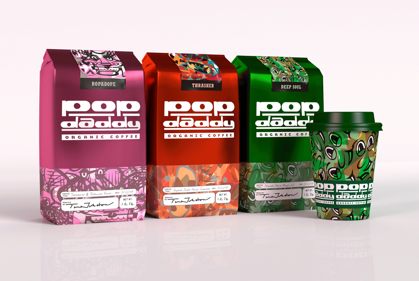
The packaging design for the new line of bespoke, small-batch coffee, POP DADDY, epitomizes the brand's fanatic attention to quality and its devotion to crafting artisanal blends that boast superior aroma and taste. With its elegant and sophisticated aesthetics, the design incorporates rich, warm colors that evoke the lush terrains of coffee origins, alongside tactile materials that invite touch, subtly conveying the bespoke nature of each batch. Gold foil accents highlight the exclusivity and premium quality, while clear, artisanal typography and imagery of coffee cherries and beans narrate the journey from bean to cup. This design not only promises a sensory delight that matches the product's refined flavors but also establishes POP DADDY as a beacon of luxury in the coffee industry, appealing to connoisseurs and casual coffee drinkers alike.
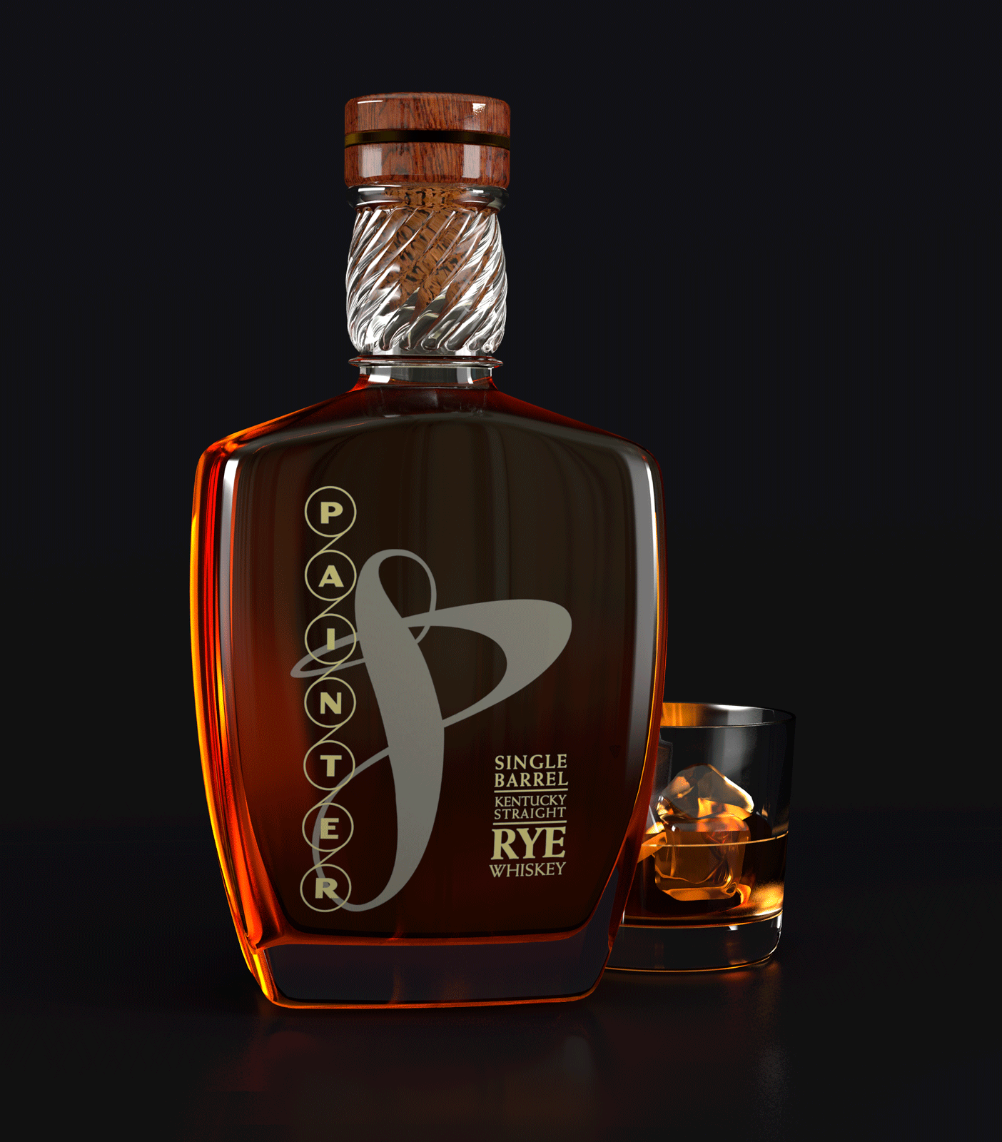
The packaging design for Painter Rye stands as a remarkable testament to the master distillers' commitment to artistic excellence, embodying a seamless blend of distilling mastery and visual allure. Each bottle is cradled within a presentation tin that captivates the eye with its painterly aesthetics, suggesting not just a beverage but a piece of art worthy of display. This thoughtful design reflects the distillers' pride and meticulous care in their craft, with every element, from the bottle's shape to the tin's intricate illustrations, crafted to evoke the essence of the rye's rich, complex flavor profile. The result is a packaging that transcends mere functionality, inviting connoisseurs to appreciate the spirit's quality and the creative passion imbued in its presentation, making Painter Rye a masterpiece of both taste and visual expression.
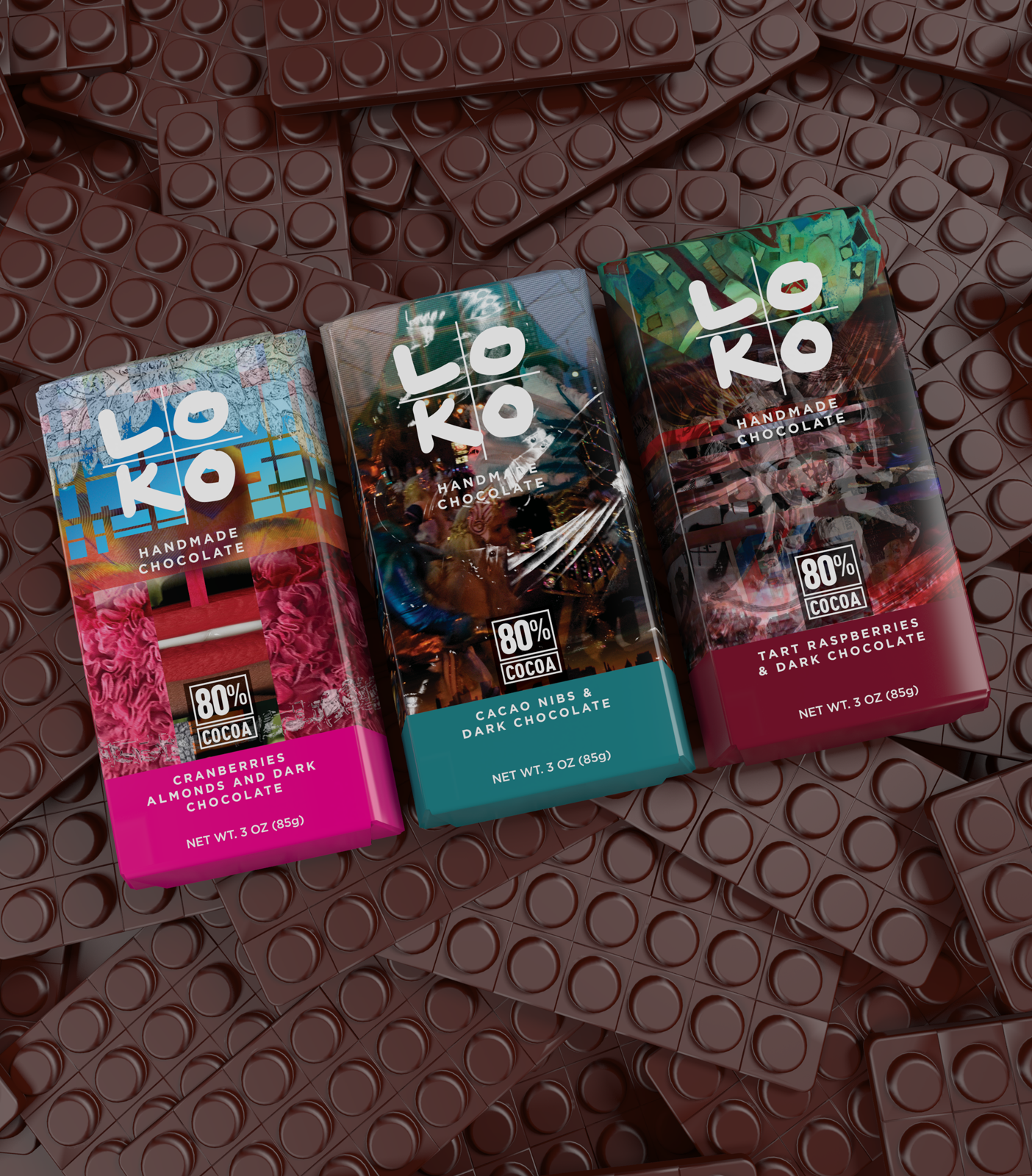
The packaging design of LOKO CHOCOLATE exemplifies elegance and luxury, artfully encapsulating the brand's commitment to handcrafted excellence and the pursuit of the richest flavors in chocolate craftsmanship. Each element of the design is meticulously curated to evoke a sense of indulgence and premium quality, from the choice of materials to the intricate details and textures that grace the surface of the packaging. The sophisticated visual aesthetic not only reflects the artisanal nature of the chocolate bars within but also promises an unparalleled sensory experience, inviting consumers to savor the depth and complexity of flavors that LOKO CHOCOLATE prides itself on. This packaging is not just a container, but a gateway to a world of exquisite taste and a celebration of chocolate-making artistry at its finest
To add
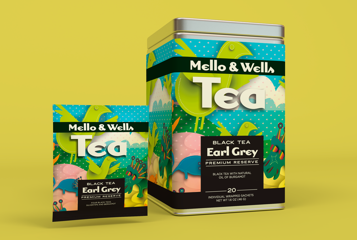
The packaging design for MELLO & WELLS TEA embodies a fusion of tradition and wellness, reflecting the brand's deep-rooted passion for herbal teas that transcend the ordinary. With a focus on showcasing their exceptional range of traditional and medicinal blends, the design captivates consumers through its vibrant visuals and thoughtful details. Each element, from the color palette to the textures, is carefully chosen to evoke a sense of warmth, authenticity, and healing, promising an immersive experience that begins even before the tea is brewed. This approach not only differentiates MELLO & WELLS TEA from average commercial brands but also resonates with consumers seeking a more profound connection with their choice of beverage, making each cup a testament to the art and science of herbal tea.
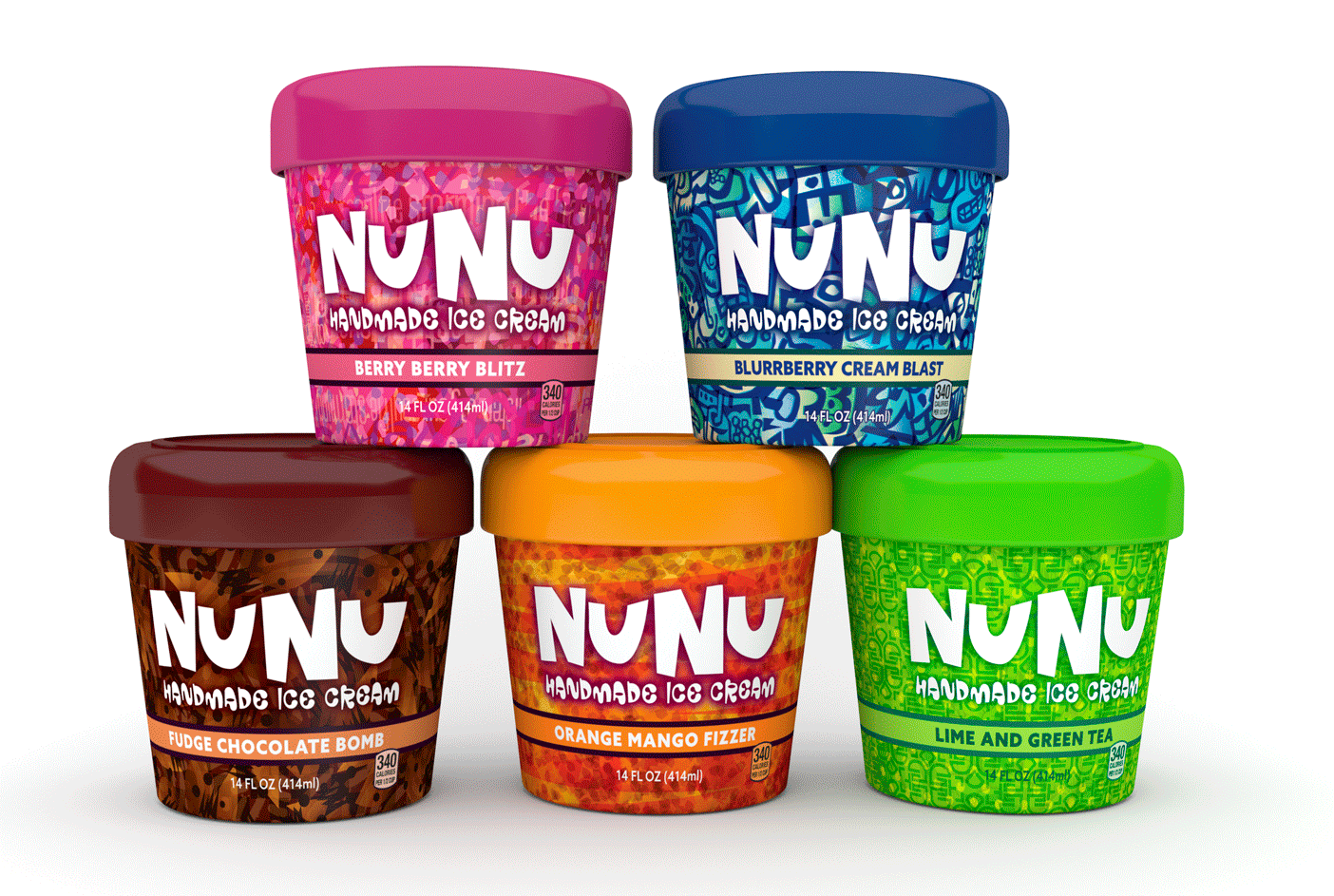
The packaging design of NUNU ICE CREAM encapsulates the brand's vibrant and youthful spirit through its lively and colorful aesthetic. Crafted with the intention of capturing the attention of consumers amidst a crowded store freezer, the design utilizes a playful and exuberant approach that reflects the handmade essence of the ice cream. Bold typography, a dynamic color palette, and whimsical illustrations combine to create an eye-catching visual that not only differentiates NUNU ICE CREAM from its competitors but also communicates the brand's commitment to fun and quality. This strategic use of design elements ensures that the packaging is as memorable and inviting as the delicious ice cream it encases, appealing directly to the brand's energetic young target audience.
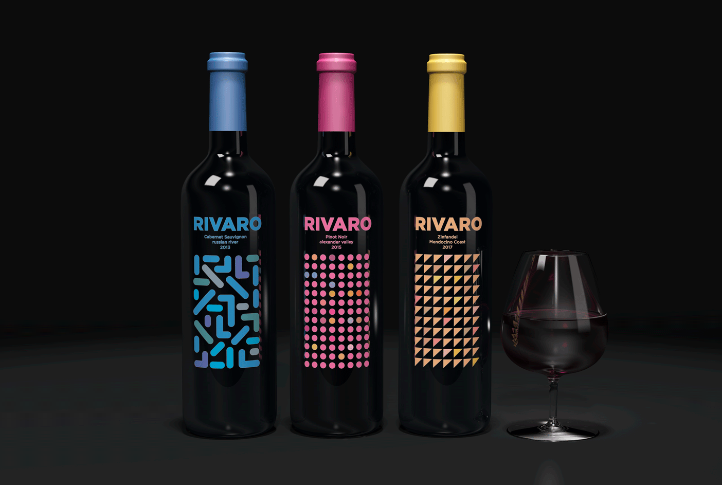
The packaging design of RIVARO WINE embodies a bold and contemporary aesthetic, tailored to cater to the sophisticated tastes of young wine aficionados. Distinguished by its vibrant geometric patterns, each bottle variation stands out, offering a unique visual appeal that sets RIVARO WINE apart in the competitive landscape of boutique California wines. This design strategy not only captures the essence of modernity and elegance but also aligns with the brand's ambition to resonate with a discerning clientele who appreciate both the quality of the wine and the creativity of its presentation.
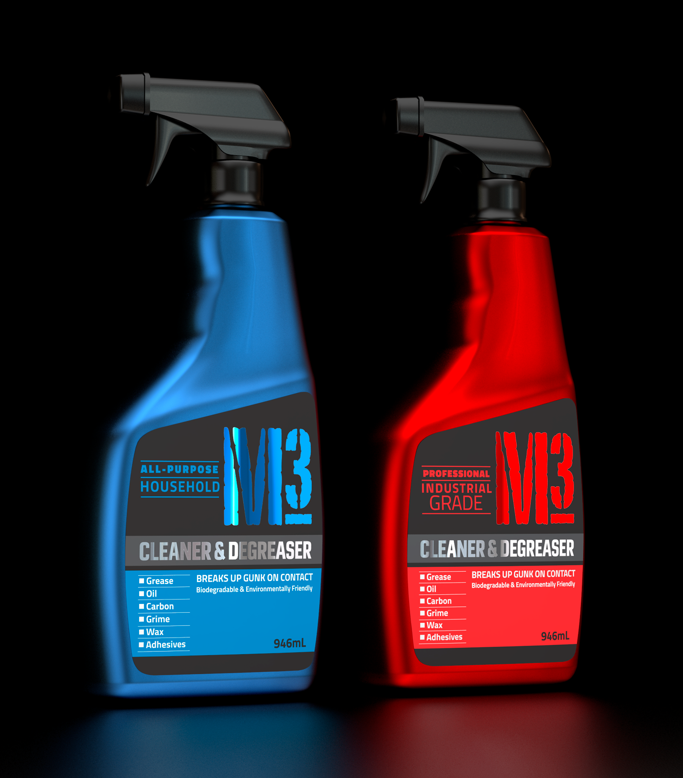
The packaging design of M3 CLEANER and DEGREASER masterfully combines functionality with a narrative, encapsulating the essence of a high-performance product ideal for both home and workshop environments. Its design communicates strength and efficiency through bold typography and a color scheme that grabs attention while hinting at the product's powerful degreasing capabilities. Strategic use of imagery and icons not only highlights the product's diverse applications but also tells a story of transformation—suggesting that even the toughest grime and grease stand no chance. This packaging is not just a container but a promise of cleanliness and restoration, inviting users to experience the unmatched effectiveness of M3 CLEANER and DEGREASER firsthand.